Nourishing Cultures

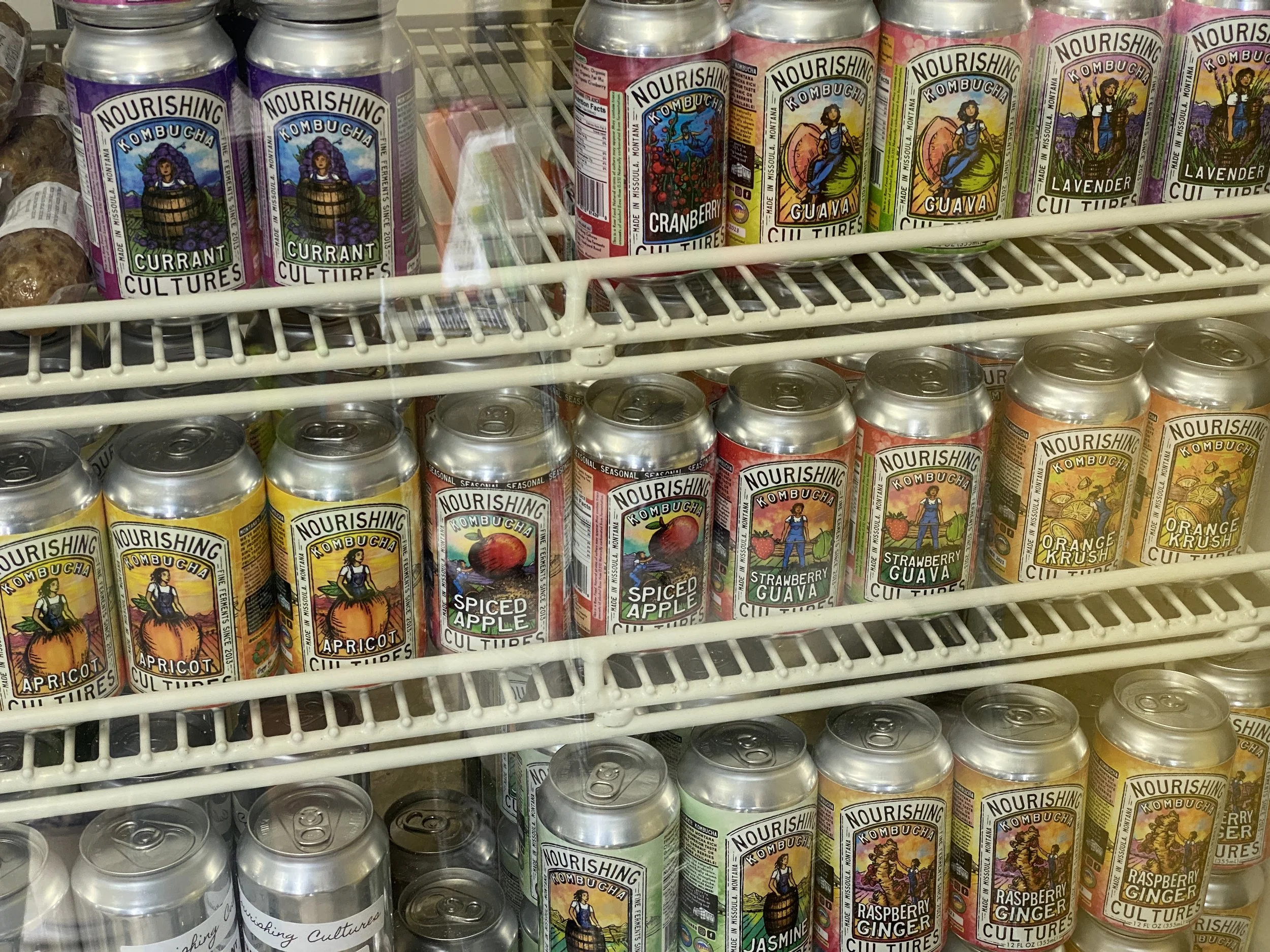
I’’ve been working with Nourishing Cultures for several years now, what originally started as just coloring a logo (drawn by my good friend and talented artist David Miles Lusk) for some tap handles. Through multiple pivots we have learned many aspects of creating a canned brand from the ground up. They are now found all across Montana, even gas stations! Which I personally think is super cool to have locally produced and healthy alternatives at places like those. As well now found in the greater region and available at various health oriented markets across the country.


Nourishing Cultures Kombucha


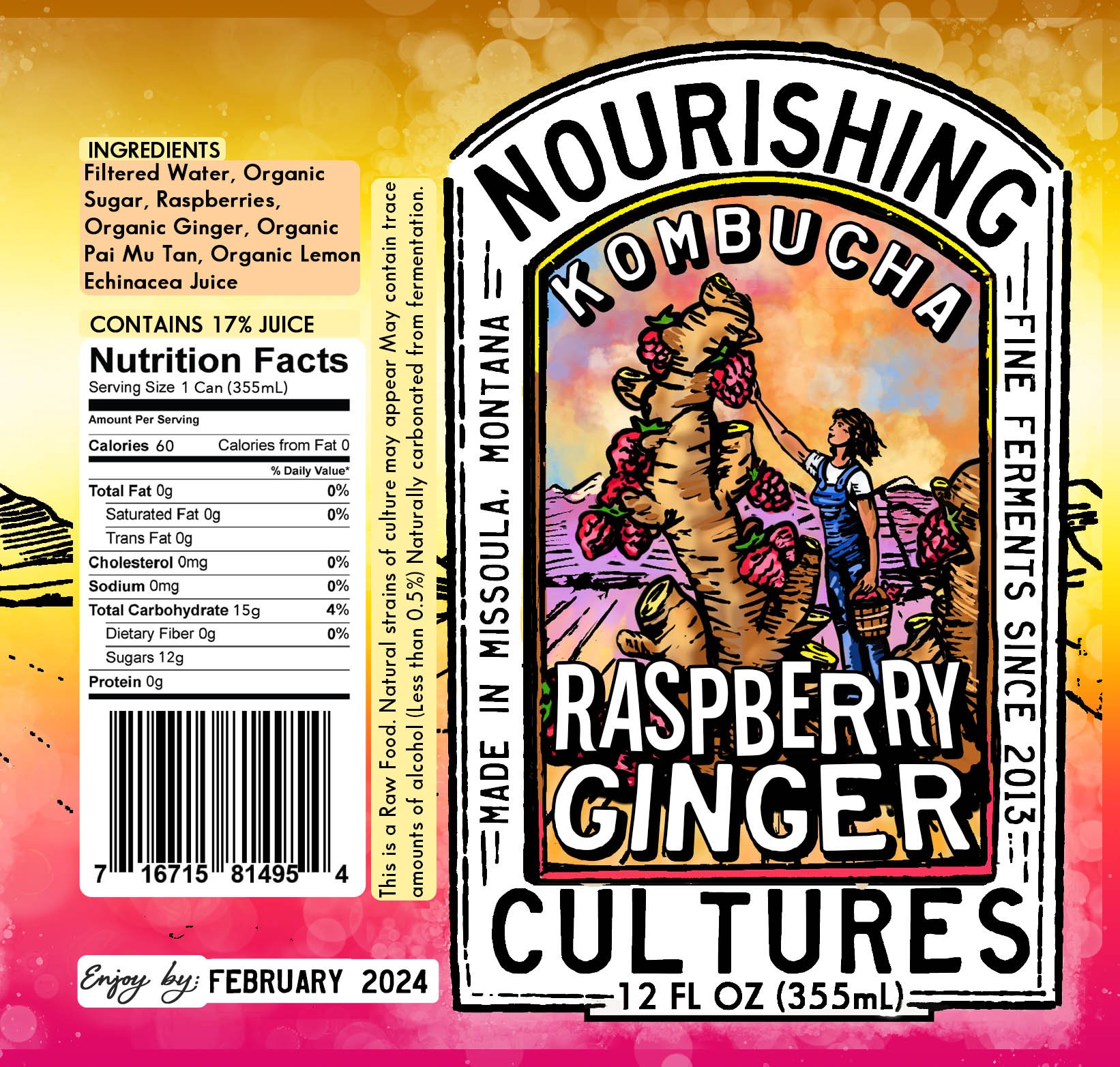
What started as an overall-clad lady in a barrel has slowly morphed into the main elements of the brand’s mascot/superhero. She can be found engaging in a variety of activities as varied as their flavors. The colors for each label are usually based on colors of from the actual Kombucha.


Creating truly unique labels for every flavor is something we saw wasn’t being done in the Craft Kombucha field nearly as often as in that of Craft Beer.


Various ads to be turned into banners and other place specific advertising.


One of the earliest versions in our canning journey, a large crowler with a space to handwrite each flavor.


